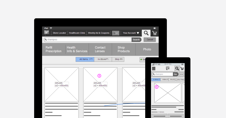
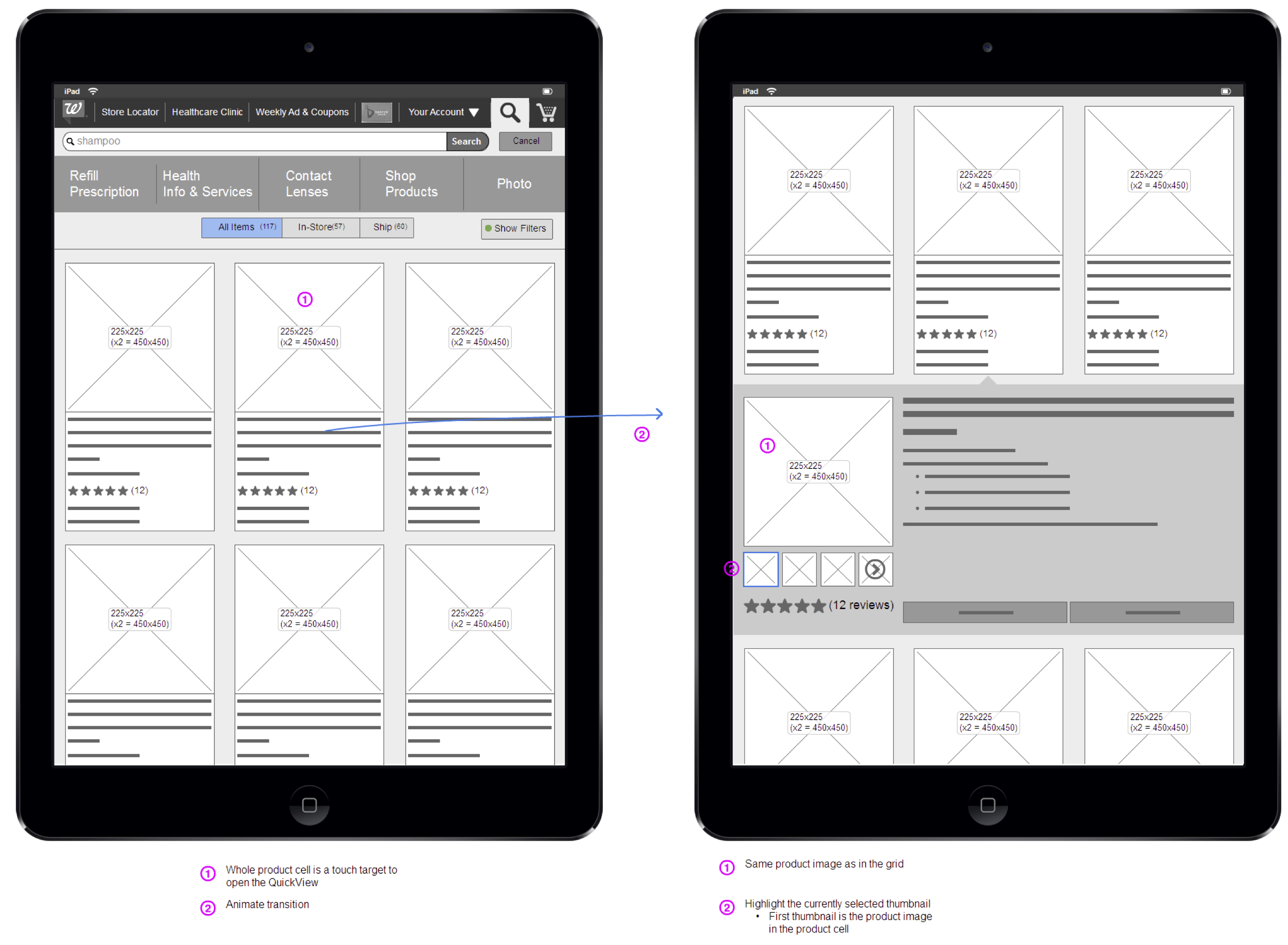
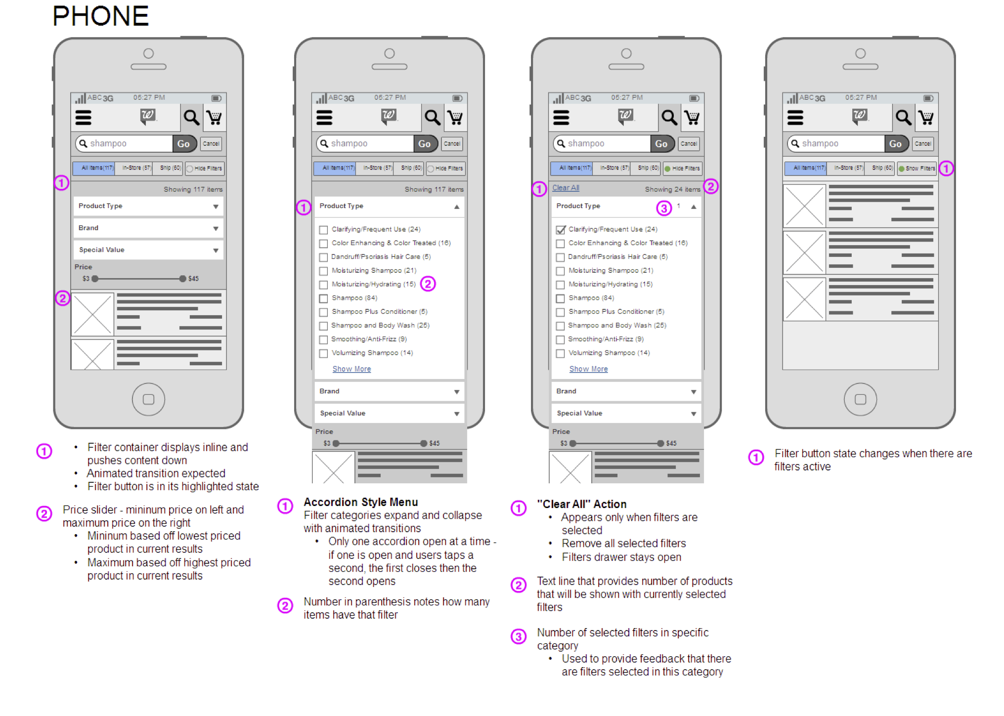
I was part of a small team to determine design and development solutions for a mobile first responsive/adaptive website for Walgreens.com,as well establish new processes that better supported an adaptive website. I continued to consult with the web team as the adaptive project was planned and executed. My consulting role was to provide design guidance for mobile, help shape design process to be more compatible with development, and mediate design and development conversations.
Goals
- Develop new design and development process for multiple break points
- Explore new cross breakpoint design patterns
- Experience enhancements through more intelligent development techniques (caching, service calls timing, separation frontend and backend)
Design Approach
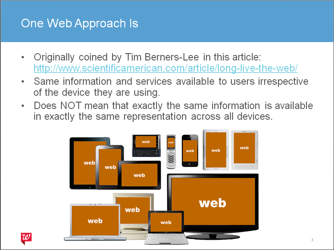
In order to ease the transition into adaptive/responsive design I created a design approach that I presented and shared out.
Deck: One Web Approach v1


