In addition to the restructured navigation, more future-forward components were included — a personalized messaging system, promotions, and dynamically added server-side features. Due to the extent of the changes, many explorations were done with multiple rounds of user research. This project was created and led by the Customer Experience team. As the lead user experience architect, I was responsible for the majority of the exploration and specification work. I collaborated with visual designers, development, and product management to define requirements, prepare patterns for future use in code, and begin the conversation about upgrading our web services to support a future personalized messaging engine.
Highlights
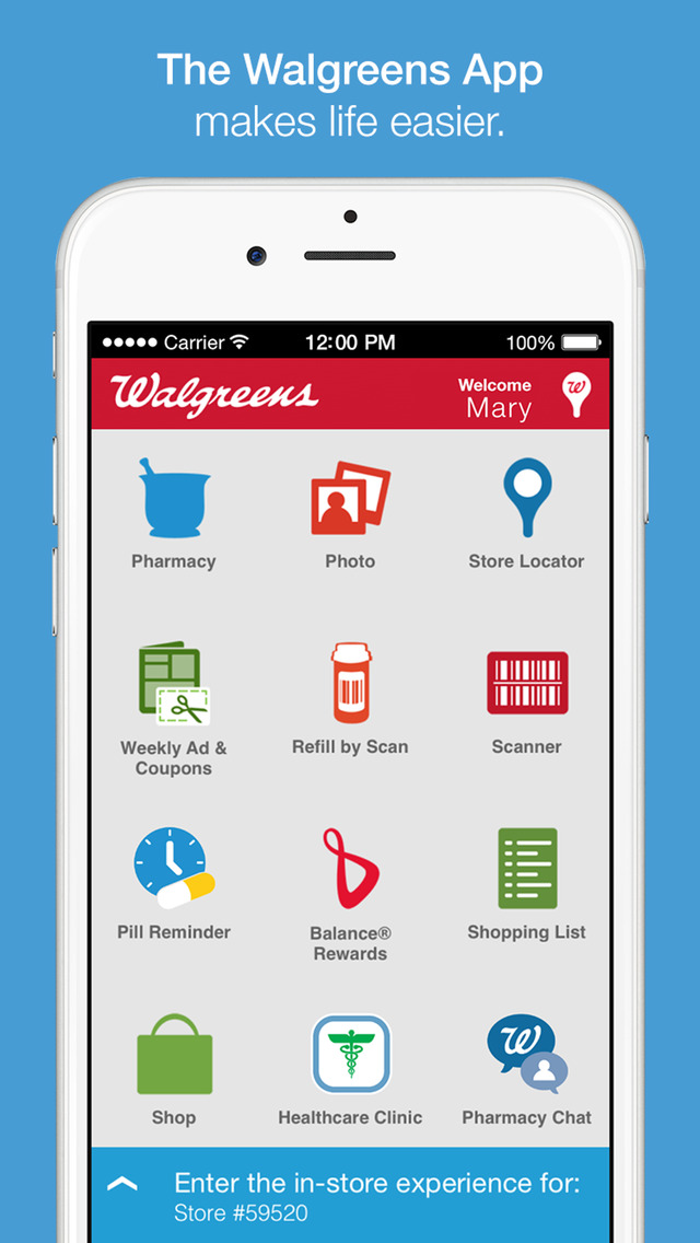
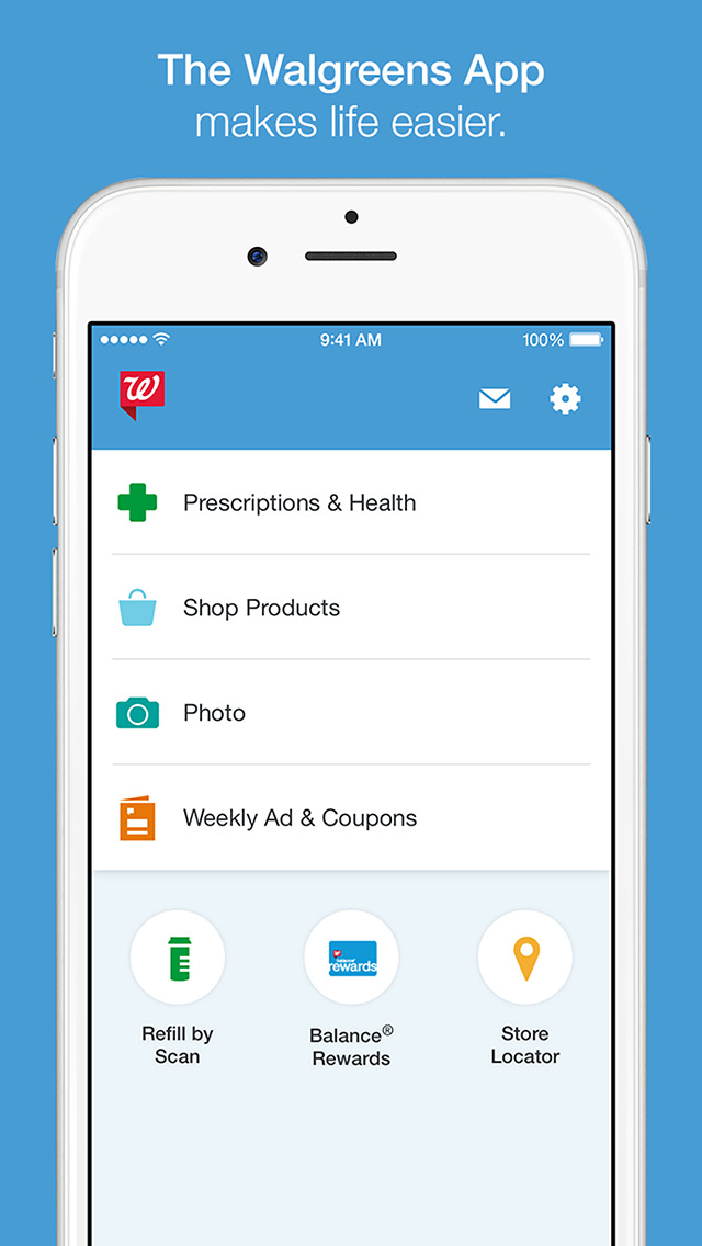
- Re-architecting and Redesign Home Screen Pattern
- Visual Design System Update
- Foundational Module System Work
- Predictive Experience with a Personalized Messaging Engine
- Hybrid (Native and Web) Shop Products Experience
- Experience Solutions for Integrating Marketing Capabilities
Experience Vision
After a lot of ideating, competitive analysis, customer data, three principles were determined to be the vision for the Walgreens app’s future vision. They were:
Dynamic – experience should be able to update without an app release, be highly interactive, and consistently engaging.
Contextual – experience should be aware of a users current context, based on location, time of day, seasonality, etc.
Personalized – experience should initiate based of app engagement, account activity, and any behavior monitored by Walgreens.
Ideation
Due to the immensity of the impact of a home screen change, I started early developing many design ideas. Ideas ranged from basic UI structure, to building blocks, to full concepts.
Research Concepts
Concepts were vetted internally as well as through four rounds of user research. Research included two early generative research and concept evaluations, a formative concept evaluation in-person usability test, and a final validation usability test across interactive prototypes — from an early drawer pattern to tabs to the near-final design.
Strategic Acceptance
The CX Director and I had to present to many key stakeholders the new design due to level of impact.
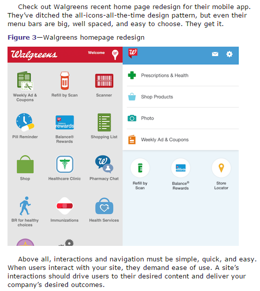
Before and After
Outcomes
- App Store rating increased (Android 4.1 to 4.2) and raised CSat scores to all-time highs (+2pts).
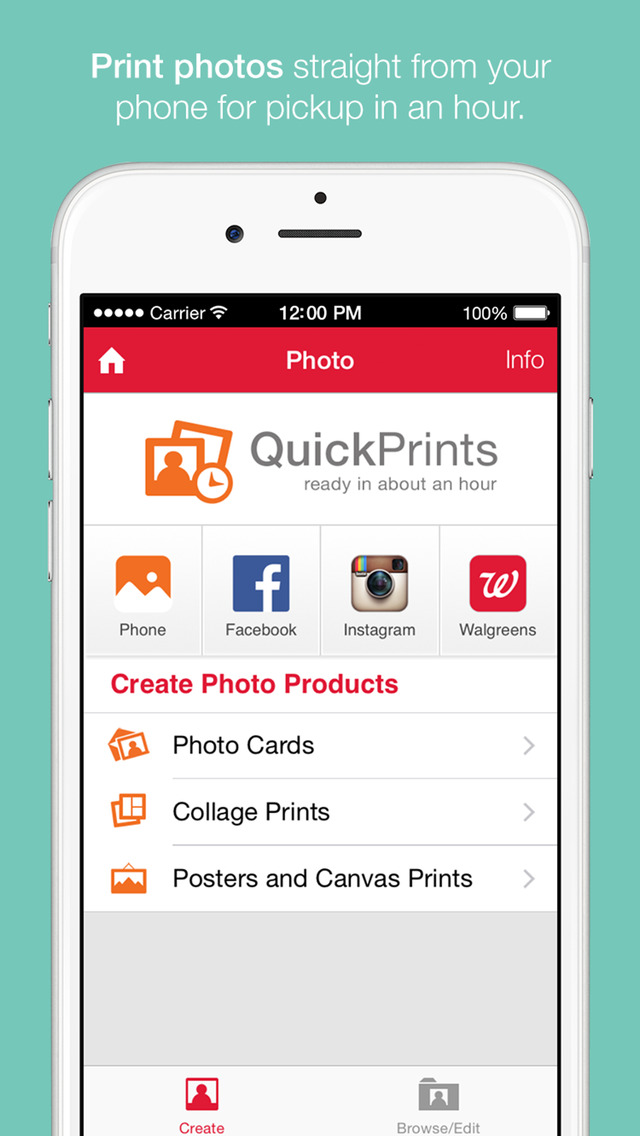
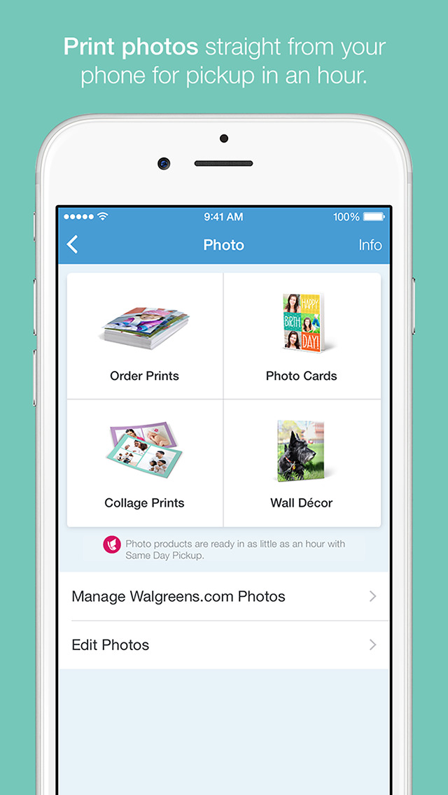
- 2x sales increase of photo products, especially iOS. Due to fixing usability issues on the product selection screen plus adding space for a promotional spot.
- Future positioning for personalization and predictive experience.
- 40% conversion on home screen widgets, even with widgets being over-displayed.
Press
- Walgreens gets 5.3 million app-driven store visits per week — MobiHealthNews
- Walgreens’ new app anticipates users’ needs with intelligent messaging — Mobile Commerce Daily
- Kantar Retail IQ analysis
- What the Past Five Years Have Taught Me About UX Design — UXMatters