Reference · the tokens & components that power this site
Design System
A living style guide rendered from the real CSS. Everything here is defined in
src/styles/global.css — tokens live in the :root block,
components are the classes below. Change a value there and it changes everywhere.
Theme families
src/styles/themes.css
Every visit generates a theme: a family picked by visit count, an accent hue from the
viewer's timezone, and light or dark from their local time. The tokens below are the
Original family. Preview any family on any page with ?theme=.
Color tokens
--var · :rootProject gradients
.proj.p1 – .p4.p1 linear-gradient(135deg,#5b5bff,#00e5ff) .p2 linear-gradient(135deg,#ff2d6b,#ff8a00) .p3 linear-gradient(135deg,#0a0a0f,#2a2a55) .p4 linear-gradient(135deg,#d4ff00,#00e5ff) Typography
--font · --monoAg
Ag
h1.display
Display ↗
.sec-head h2
Section heading
.tag
A lead paragraph with an emphasized gradient phrase woven in.
.prose p
Body copy in prose. Designed for reading — 720px max, 1.7 line-height, with cyan links and inline code.
.kicker / .ey (mono)
Monospace label · meta text
Buttons & pills
.btn · .pill .btn Button label →
.pillz / .pill
React Astro Design Systems TypeScript
Cards
.card · .nowCurrently
A standard hover card with a label and a headline.
pill pill
Feed
09:24pushcommit message text…
11:02mergeanother row in the feed list
Project tiles
.work · .projProject 2
Project 3
Project 4
Posts list
.posts · .postImage lightbox
<Lightbox /> · lightGallery
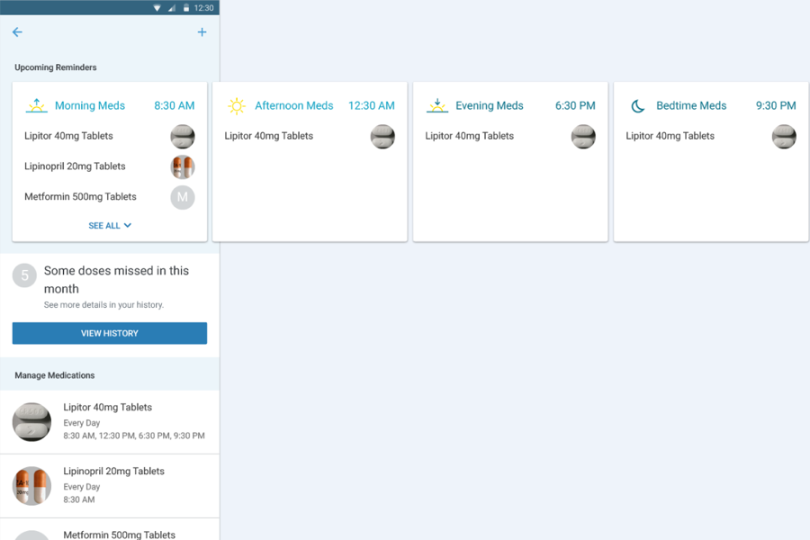
Content images inside .prose open in an in-page viewer themed to the
site's tokens — click the image below. The image's alt text doubles as
the caption. Every page that renders body content mounts
<Lightbox /> (rule in AGENTS.md).
Effects & motion
global.css + Base.astro.glow— fixed luminous accent field: one smooth, static radial light per accent (acid, electric, cyan) behind everything. No drift, no grain — it gives the glass something to refract.nav— floating glass pill:--glass-fx(blur+saturate+brightness) over--glass-fill, a specular gradient-ring edge (::before) + inner top highlight (::after), soft--float-smshadow..cursor/#cur— custom acid dot that follows the pointer and swells to a hot circle (.big) over interactive elements. Hidden on touch..dot— pulsing acid status dot (@keyframes pulse)..reveal→.reveal.in— scroll-triggered fade/slide via IntersectionObserver inBase.astro.<Lightbox />— prose images open in a token-themed lightGallery viewer; the cursor dot hides while it's open (body.lg-open).::selection— acid background, black text.- Hover transitions live on
.card,.proj,.post,.btn, nav links.
To change anything here, edit src/styles/global.css. Tokens are in the
:root block at the top; each component above maps to the class shown in its
index label.