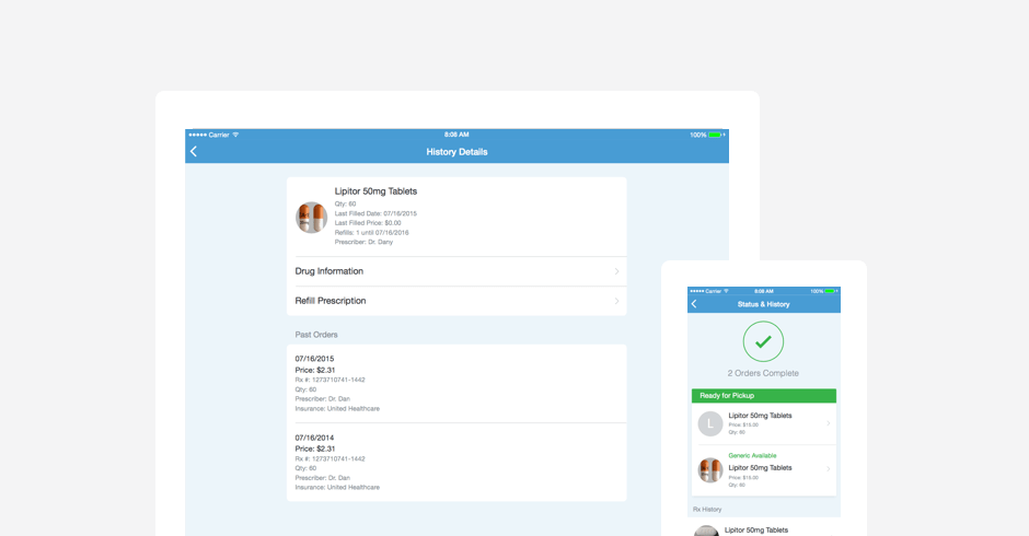
A small technical request that I was able to transform into a great opportunity to drastically enhance the experience.
Request
To update the technical service that is used in the app for prescription status. The app was using an old service that outputted incorrect information and was being eliminated. Only minor UI changes were requested – only analyze impact of new information being displayed.
UX Proposal
I determined that if we were willing to spend effort on updating the product that it would be more beneficial to update the UI to greatly improve the experience. The current experience was very difficult to use and was missing many opportunities to better integrate with other digital and physical channels. I pitched the UI enhancements by creating a prototype and early drafts of detailed design specifications.
Challenges
- Getting the money to fund the project cost. This turned out to be a small challenge because luckily I had a great product team that clearly understood the benefits. We worked together to shift items on the roadmap to accommodate this project.
- The new design was a drastic departure from the website’s experience. A large redesign of the Prescription Status experience had recently be completed for the Walgreens website. The website’s redesign had considerable amount of time spent planning, designing, and research validating. There was a lot of internal push back because of the confidence with the website’s experience. This was overcome by having User Research validate the new designs versus current website experience. The new design received high praise.
Research
I partner with our User Research team to create an appropriate study to validate the new experience and to evaluate the new app experience versus the website’s.
Method: Validation Usability Test
# of Users: 10 customers
Prototype URL: http://3u4k7q.axshare.com/research_prototype_backup_-_09_2015.html
Design Specification
Many possible scenarios had to be thoroughly analyzed to support all the conditions that pharmacy operations have. We successfully simplified the scenarios by organizing issues to more actionable categories and by combining similar scenarios.
URL: http://3u4k7q.axshare.com/
Before and After
Outcomes
- Research demonstrated a clear preference to the new design of the app versus the current websites design and the old app design. (10/10 participants)
- There were some bugs with launch that either displayed the history out of order or not at all, which caused customer complaints – validating the customer’s expectation is to see all their prescriptions in a single organized place.
- Very positive App Store Reviews concerning prescription status. “I’m able to look at my prescription history, as well as the status of my pending orders. One of the best apps out there.”
- Reduction of negative feedback over incorrect statuses – decrease in customer support calls.
- The website team quickly prioritized updates to replicate the same design system.
